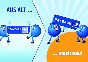
The PAYBACK bonus program is starting the spring with a fresh brand: the corporate design concept has been revised with the aim of becoming even clearer, more modern and more digital, while remaining compatible with partner brands as before and optimally integrating PAYBACK's own products and services such as PAYBACK GO and PAYBACK PAY. "It was particularly important to us to work out the 'mobile first' strategy shift in every brand element. Because with the PAYBACK app, there are even more points," says Sandra Neumeister, Director Strategic Brand and Trade Marketing at PAYBACK.
Even the PAYBACK logo is changing as a result: it will be more striking and more scalable so that it can be easily recognized on smartphones and smaller displays.
Elements such as colors and the program's brand ambassadors, the popular PAYBACK Pointees, have also been enhanced. "We liken this evolution to a tattoo that gets re-stuck after a few years so it looks nice and fresh again. However, we have not only worked on the look, but also on the emotionality of our brand and now emphasize even more strongly the characteristic 'PAYBACK is fun' in addition to our brand imperatives 'simple', 'relevant' and 'trustworthy'," says Neumeister. The PAYBACK Pointees spread good cheer and tell stories that are fun. All this is now happening at PAYBACK in a much more comprehensive color world than before. The brand refresh was implemented by the Serviceplan agency.
